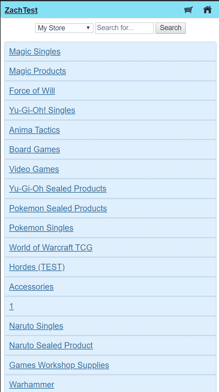
You might notice that when you look at your website on your mobile device, it looks like the above, very plain, basic, and not fun at all!
Many years ago, before responsive design was a generally accepted thing, we had to implement the above onto websites so that they loaded better on mobile devices of the past.
There is a setting in your admin under Accounts > Mobile where you can toggle the mobile site to be enabled.

With your website as it is now, you don’t need to check this option! So make sure to UNCHECK this option if your website, on your smartphone, looks out of sorts!
Also of note! For a limited time period only, we are upgrading all member’s website themes, to a select few themes, free of charge! Check out the store.crystalcommerce.com for the themes we have on offer, then reach out to a member of the support team for details on which themes are eligible for you for an upgrade!
Helping you, your store and your local game community with all your online gaming needs!
Also check out our Design Team’s past blog updates on other projects we’ve worked on to help local game stores stand out from the crowd!
Happy Gaming All!


